
Bad typography can destroy a graphic design, but what if that 'bad' typography becomes a trend? Here are some of my favourite typography trends for 2021 that are circulating online and how to use them or, if you should just forget them all together
Disruptive Typography


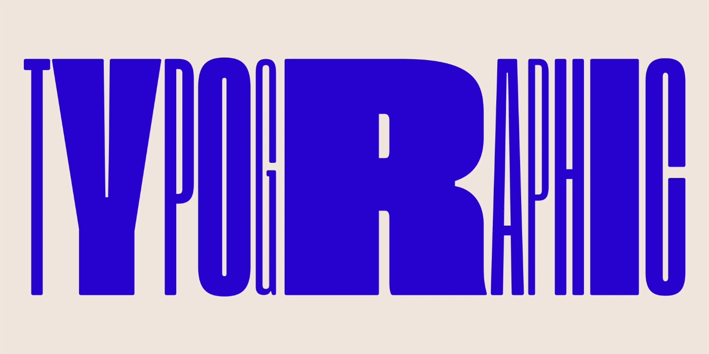
One of the fastest rising typography trends and styles to emerge last year and its growing strength in 2021 is disruptive typography. Letterforms that are squashed, stretched, dissected and twisted beyond legibility are the rage right now.
I have seen plenty of it in both print and broadcast media. I would use this trend as a decorative design asset because trying to get someone to read some of this text is difficult. This style can be a great fit for independent or progressive brands which appeal to a segment of the audience who are willing to spend the time to figure out your message.
Avoid using disruptive typography when creating brand assets because logo designs should have nothing to do with trends - they need to stand the test of time. Applying disruptive typography to a logo would render it hard to read that can cause brand confusion. And as trends lifecycle pans out, it would become untrendy in a heartbeat.
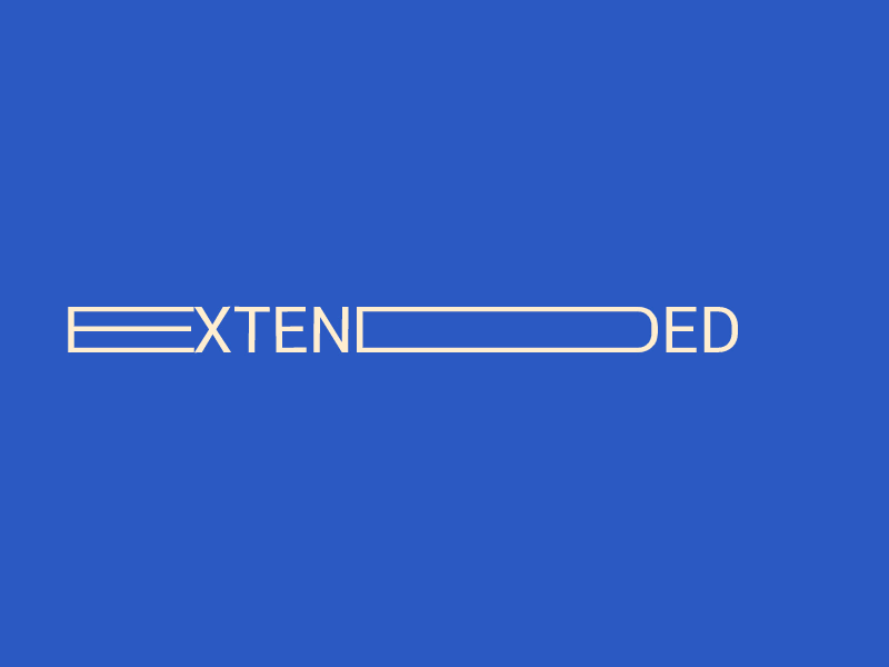
Outlined Typography


In terms of being a visual asset on a design, outlined letterforms can look pretty as a typography trend. I have been using it on some projects and have also seen it on corporate adverts and websites.
The outlined letterforms are often mixed with standard typography to create contrast and hierarchy.
While uses vary, there are a few design rules that you will want to adhere to maximise the impact and usage
Sans serif typeface
All caps text for outline letters
Paired with filled lettering
Oversized text elements
Outline typography can be a lot of fun to use. Just be cautious when it comes to legibility, colour and contrast and stroke weight. Letters can get lost in background images and videos quickly. Be mindful of its placement too.
And don’t overkill it. Outline typography works best for a point of emphasis and interest, not to create your entire message. I recommend using bold uppercase sans serif fonts for this kind of style which is great for headings and impactful designs.
Retrofuturistic Typography


A lot of the inspiration for the style of design over the last year or so has come from the 80s retrofuturistic. Boldly mixing old and traditional with a new and futuristic look and feel is a great way to give your design more optimism. Perhaps after what happened in 2020, I think optimism is something many people have needed over the last year.
I would imagine that design elements from cyberpunk have an influence on this, as well as movies such as Blade Runner and Tron which utilize retrofuturistic style of typography.
One key aspect of implementing this style is the use of wide kerning on minimal fonts - an easy effect to use that is visually appealing. Do remember that the context is key. Incorporating retrofuturistic typography requires suitability of the brief and message.
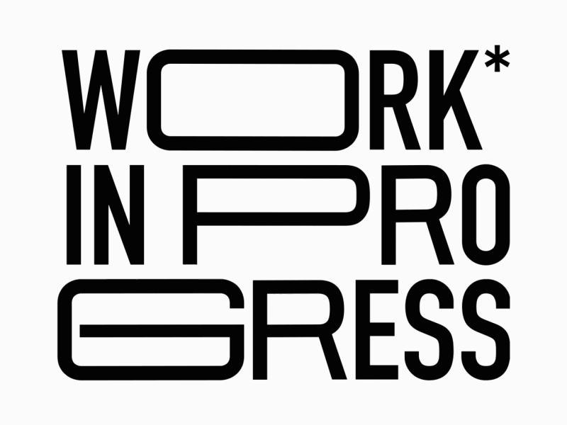
Rounded San-Serif Typography


This trend is simple in nature and, if done well, it can really create a harmonious vibe for your designs.
The rounded san-serif typography trend is so simple that you might not even see it until you start looking. What’s great about this trend is that it works with everything. Rounded sans serifs are among the most readable typefaces. It is no surprise that is being implemented a lot recently is on landing pages and website design.
Most designers using this trend are using fonts with medium to thick uniform strokes with adequate letterspacing as well. Everything about this typography trend is centred on optimum readability. Plus, you can pair it with other typography trends for an even more modern look.
Ultra Highlighted Typography


This is one of those trends that’s a little surprising to see: highlighter-style emphasis on lettering to create emphasis.
Hierarchy and contrast are crucial principles in any graphic design. Out of this principle, the ultra highlight typography trend is born, making use of colours and shapes behind certain areas of text to simply highlight one word or letter with a different colour or underlying areas of text completely. And while it might sound a little odd when you describe it, the actual visuals are pretty stunning.
When done correctly, this design element will give a visual emphasis to the audience and it comes across as more professional and well thought out. This technique is best for words that you really want users to see. It also works better for shorter blocks of text so that the highlight doesn’t get overwhelming and take over the design. Best implemented as headings and subheadings, you can also use them in a variety of different ways if you want to get creative.
As opposed to being a trend, I see the ultra highlighted typography as a fundamental principle of design hierarchy and contrast which are firmly cemented in the language of graphic design.
Typography is such an essential part of all design. My favourite typography trends are those that push the boundaries of what’s common but still maintain readability. What do you like in terms of typography?
Comments